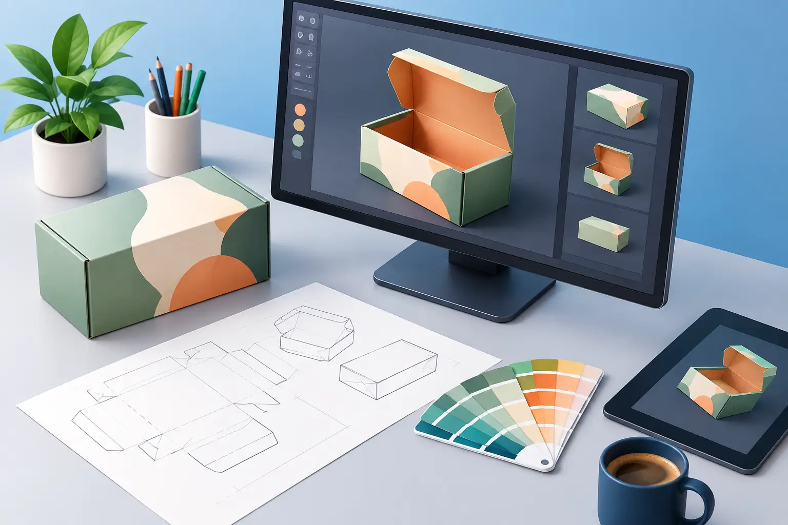
A pack can be beautifully designed on a flat artwork board and still disappoint once it becomes an object. The cap may sit too high, the label may catch light differently than expected, or a premium foil detail may disappear at shelf distance. Knowing how to visualise packaging before production turns those expensive surprises into informed creative decisions.
For brand teams, the objective is not simply to make a photorealistic image. It is to establish confidence in how structure, graphics, material and environment will work together – across campaign assets, retailer presentations, internal approvals and the final consumer encounter. High-end CGI makes that scrutiny possible before a physical sample exists, and often before final tooling or print commitments are made.
Begin with the object, not the artwork
Packaging visualisation starts with the physical truth of the product. A carton, pouch, bottle, jar or blister pack has proportion, weight, joins, edge radii and manufacturing constraints. If the underlying form is approximate, even distinguished art direction will struggle to make the result persuasive.
Start by gathering the best available source material: CAD data where it exists, structural drawings, dielines, engineering dimensions, reference photography and samples from previous iterations. The chosen CGI artist can then build or refine a precise 3D model that represents the pack as it will be made, rather than as a generic stand-in.
This stage deserves close attention for products with recognisable silhouettes. A fragrance bottle’s shoulder, the thickness of a cosmetic jar’s lid, or the way a food pouch stands at its base can carry as much brand recognition as the logo itself. Minor inaccuracies become conspicuous when the image is used in a large-format campaign or motion piece.
Resolve what is fixed and what is still open
Not every project enters visualisation at the same level of certainty. Sometimes the pack structure is final and the task is to explore creative territories. In other cases, the visualisation is needed to support a choice between forms, closure systems or label placements.
Be explicit about which elements are non-negotiable and which are under review. This gives the production team room to test meaningful options without treating every frame as a technical approval. It also protects the process from a common problem: refining premium imagery around a detail that will later change.
How to visualise packaging as a material experience
A pack is read through its surfaces as much as its shape. Glass, coated paper, uncoated board, recycled plastic, brushed metal, embossed stock and soft-touch laminates each respond to light in distinctive ways. CGI earns its place when those responses are observed and recreated with care.
A convincing material is not merely a colour applied to a model. It needs the right balance of reflectivity, transparency, texture, thickness and microscopic imperfection. Clear glass may reveal liquid depth and internal reflections. A metallic closure may need soft, elongated highlights to feel machined rather than chrome-plated. Matte board should retain a restrained grain without looking dusty or artificially rough.
Special finishes require particular discipline. Foil, spot UV, embossing, debossing and varnish can transform a design, but they are angle-dependent. A detail that looks exceptional in a frontal render may vanish when the pack is turned slightly. Test these finishes across the intended camera angles, particularly if the work will become animation.
There is a trade-off here. Perfect physical fidelity can sometimes make an image visually quieter than a campaign needs. A premium visualisation should respect material behaviour while allowing art direction to shape the result. The answer may be a slightly elevated highlight, a more considered viewing angle or a controlled studio environment – not a material that behaves implausibly.
Treat lighting as part of the pack design
Lighting determines what the audience notices first. It reveals form, separates materials and establishes whether the product feels clinical, indulgent, technical, playful or rarefied. Yet it is often left until late in the process, as though it were a finishing treatment rather than a design decision.
For ecommerce, lighting generally needs to prioritise clarity. The silhouette should read immediately, the label must remain legible and the customer should be able to understand the object without ambiguity. For a launch campaign, the same product may benefit from more dramatic contrast, sculptural shadow or an unexpected environment that gives the pack cultural presence.
Create visualisations for the actual use case. A hero image for an out-of-home placement, a retailer listing, a press kit and a social animation need not share the same camera language. They should share the same product truth, but each can be composed to do its job well.
Check the pack at three distances
Visualisation is most useful when it considers how people really encounter packaging. At distance, the silhouette, colour blocking and primary brand signals must carry. At arm’s length, the hierarchy of name, variant and benefit needs to work. Close up, craftsmanship becomes visible: the type alignment, edge quality, print finish and material detail.
A common mistake is approving a render only at full-screen scale. Review it reduced to likely shelf, mobile and advertising sizes. If the key information collapses at a small scale, a magnificent close-up will not solve the commercial problem.
Build the variant system early
Many packaging projects involve more than one SKU. Flavours, strengths, sizes, markets and limited editions can quickly create a complex family of artwork. A single hero render may make the design appear resolved, while the wider range exposes weak differentiation or inconsistent hierarchy.
Visualise a representative spread of the range before committing to a complete asset library. Put adjacent variants together, test colour relationships and make sure the pack architecture supports fast recognition. This is especially valuable in food, beauty and pharmaceutical categories, where consumers often make decisions in seconds.
It also has practical value for production. Once the master model, materials and camera system are established, a well-organised CGI workflow can generate a coherent suite of approved variants efficiently. That does not mean every SKU should be treated mechanically. Flagship products, seasonal releases and market-specific packs may require their own art direction.
Place the product in a believable context
A clean studio render is essential, but it answers only part of the question. Packaging is handled, stacked, opened, displayed, chilled, carried and photographed under imperfect conditions. Contextual visualisation reveals whether a design has enough presence beyond its isolated hero shot.
For a beverage, that may mean condensation, liquid translucency and a credible serving moment. For a skincare range, it may mean a bathroom setting where glossy caps and pale labels must remain distinct. For technology or pharmaceutical products, it may mean demonstrating precision, tamper features or component relationships without sacrificing visual refinement.
The context should clarify the product’s value, not compete with it. CGI offers unusual control here: set dressing, camera position and light can be adjusted without the cost and logistical limitations of a physical shoot. That control is most valuable when it is used with restraint. An elaborate scene cannot compensate for packaging that lacks a clear visual proposition.
Use approvals to protect quality, not slow it down
Packaging visualisation often involves brand, design, legal, product and commercial stakeholders. Without a clear review structure, feedback can become contradictory and late-stage changes can erode both quality and budget.
Set approval gates around the decisions that materially affect the work: structural model, artwork application, material and finish tests, lighting direction, and final output requirements. At each point, ask reviewers to assess the right thing. Structural approvals should not become debates about background styling; art-direction approvals should not reopen dimensions already signed off.
Transparent communication matters as much as artistic mastery. A managed CGI production process should make assumptions visible, identify risks early and distinguish between a visual decision and a manufacturing specification. A render can represent the intended finish with remarkable accuracy, but it does not replace press checks, material testing or regulatory review.
Plan for every final format
Before rendering begins, define where the assets will live. Still imagery, retailer content, digital advertising, product configurators, social crops and animation may all require different aspect ratios, levels of detail and technical outputs. Planning this early protects consistency and avoids recreating a hero asset later because its composition cannot accommodate a vertical format.
For animation, consider the pack’s movement from the outset. A rotating bottle may need label alignment and reflective behaviour checked frame by frame. A carton opening sequence needs credible folds and tolerances. These are small details, but they are precisely where audiences recognise whether a product visual has been crafted to an award-winning standard or merely assembled.
The strongest packaging visualisation does more than preview an object. It gives everyone involved a shared, exacting view of what the product should become – then gives the brand the freedom to present it at its most compelling.